
Booktrack
AI Product Design
Booktrack turns any book into an instrumental Spotify playlist to read to. Each playlist is built around the story’s mood and setting, so the music deepens the reading without creating a distraction.
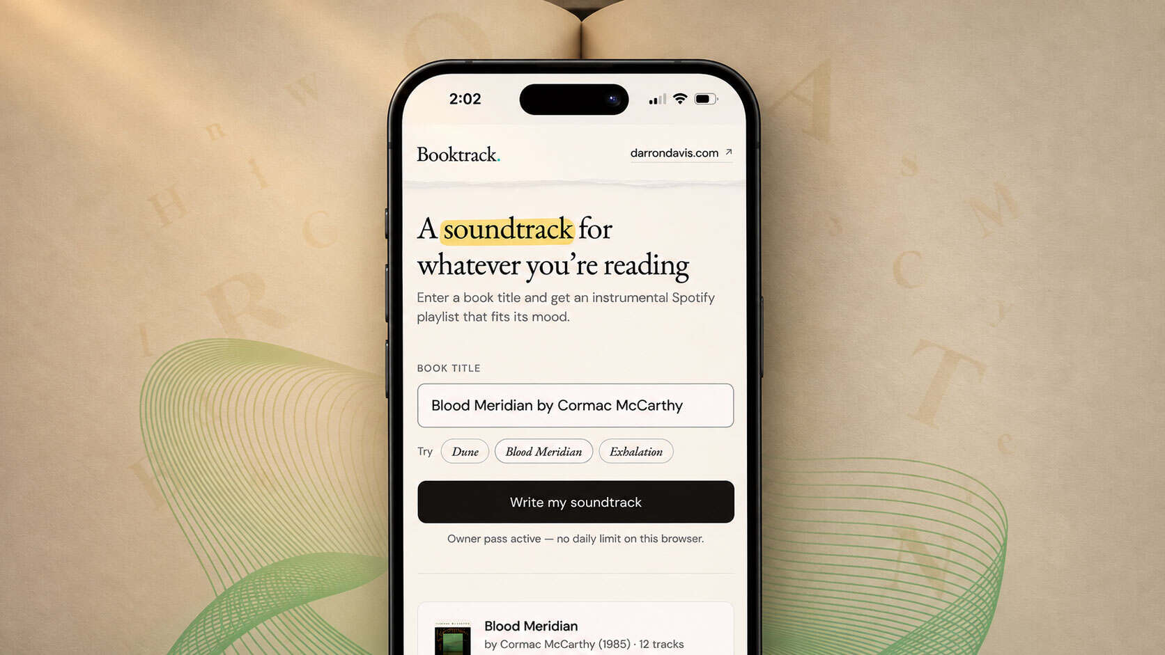
Focus on reading by listening
When I sit down to read, little things pull me out of the book like the refrigerator humming, a dog barking down the street. So I’d put on music, which meant hunting for a playlist that matched the mood of whatever I was reading. Even when I found the right one, a song with lyrics would come on and I’d lose my place. I often spent more time searching than reading.
That problem inspired Booktrack, a small product I built to show how I take an AI idea from a first prompt to something real people can use.
What prompted this?
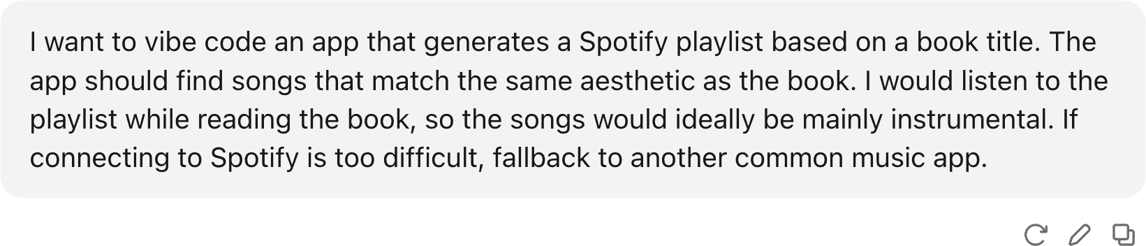
My first prompt got me further than I expected. It was the start of an idea, with little detail or direction. Then came the tweaks.
Adding and subtracting
Once the bones were in place, the fun part started: shaping the experience, adding features and cutting distractions.
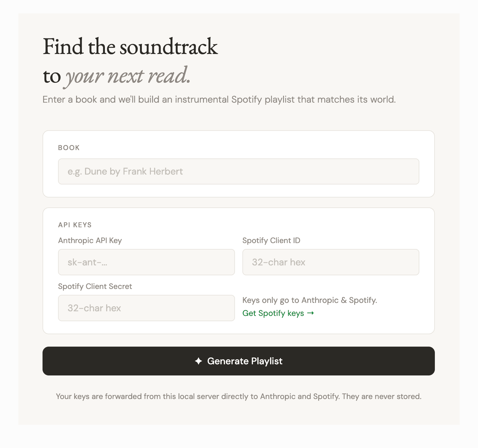
First rendered screen after a few back-and-forths with Claude.
First to go was the biggest barrier: asking visitors for their own API keys before they could make a playlist.
Verify every track on Spotify
Claude will confidently suggest songs that don’t exist. A single fake track can make the entire experience feel untrustworthy. So Claude now suggests 25 tracks, the server checks each one against Spotify’s catalog, and only 12 real ones make the list, with no more than two per artist for variety.
Show tracks as they’re confirmed
Checking 25 songs takes time, and a spinner with nothing behind it felt like the app had stalled. Now each track appears the moment Spotify confirms it, so the first song shows up in seconds and the list fills in while you watch. The total load time barely changed, but it felt much faster.
Screen recording showing tracks appearing as they are verified.
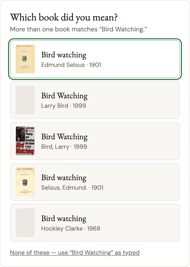
“Did you mean?”
Many books share a title, and guessing wrong gives you music for the wrong story. When a search matches more than one book, Booktrack shows a short list with each cover, author and year, pulled from Open Library.
Remove per-track reasons
Early versions explained why each song fit the book. It was a nice touch, but I doubted people would take the time to read them. It also risked giving away plot points. I cut the additional text, made the prompt spoiler-free, and replaced a flowery mood paragraph with one plain line about how the music sounds.
Cutting the track descriptions removed about 60% of the text Claude writes per playlist, which saves 5–15 seconds per search.
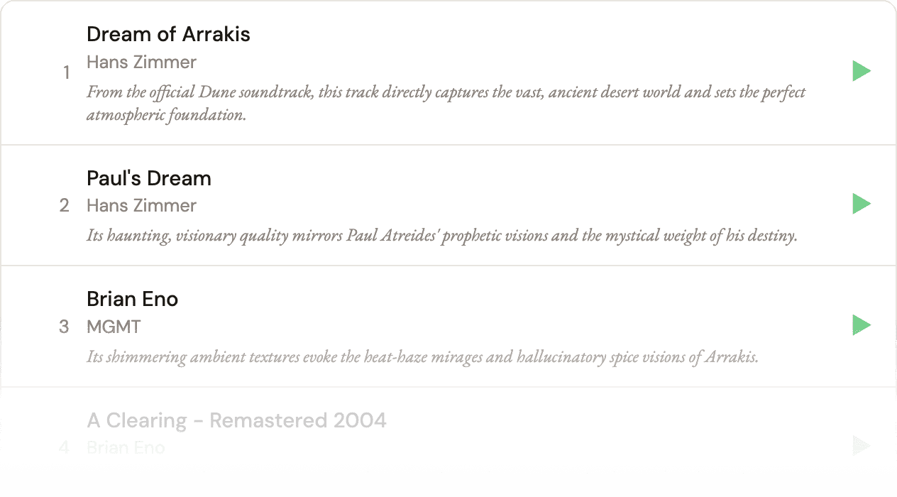
Example of track explainations that I decided to remove.
No sign-in
To try out Booktrack, you shouldn’t have to do any setup first. Signing in to an account or entering API keys would lose people immediately. Anyone can make a playlist and preview tracks without logging in. Saving it to your own Spotify library is still there as an option.
Start with an example
An empty results area only tells people what might happen. I wanted them to see a real playlist before typing anything, so the page opens with a Dune soundtrack I generated once and saved. It loads instantly and doesn’t count toward anyone’s three free playlists a day.
Cost controls
A free public site that calls a paid AI service needs guardrails. Each visitor can make three new playlists a day, the whole site has a daily cap, books someone already searched load from a saved copy at no cost, and failed attempts don’t count. That keeps the bill small and predictable without getting in a curious visitor’s way.
Staying on track
The player went through six versions, because Spotify only allows playback through its own embedded player for visitors who aren’t signed in.
The first version had a play button that linked out to Spotify. It made for the cleanest interface, but leaving the site for every track was a non-starter. I also shipped a custom list with a docked player, then reverted it quickly because it wasn’t easy to skip through the playlist and was buggy on mobile.
One Spotify player per track was cleaner, but it needed fixes for phones and for autoplay, which broke when Spotify’s player script started relying on a browser feature my site’s security settings blocked. I was able to work out a solution with Claude’s help.
The final version keeps Spotify’s players in the list and adds Play all and a playback bar on top, so it plays like one playlist on desktop and iPhone.
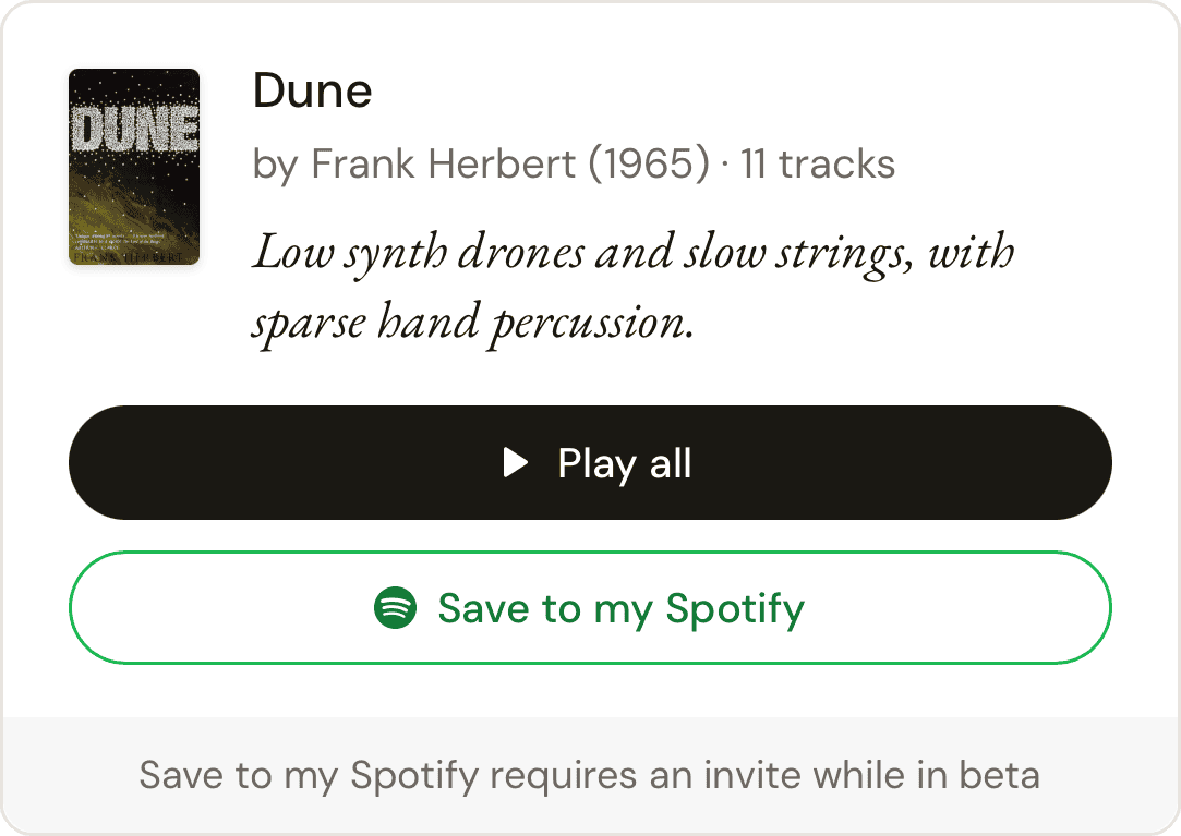
I added a Play all button so people can hear the whole playlist without tapping each track.
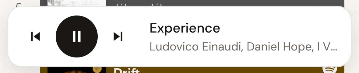
A floating playback bar keeps play, pause and skip within reach wherever you are on the page.
Cover art
I had a working app, but it looked like every other AI-generated one out there. I wanted it to feel more like a book, so I stripped out the generic stuff and added a few physical details.
It’s giving AI
I removed the sparkle icon, generic “Generate Playlist” button text, emoji on results, and Claude’s flowery mood paragraph.

I removed some AI tells like the sparkle icon.
Ghost text background
I added faint passages from public-domain novels that drift behind the page, drawn with WebGL, paused when hidden and still for reduced-motion users.

Example of ghost text background animation.
Header texture
I included a deckle edge texture so the header reads like the edge of a book’s pages. I kept it subtle on purpose, so it wouldn’t distract from the playlist.

A deckle edge is the rough, untrimmed edge you find on handmade paper.
Highlight
I marked the word “soundtrack” in the headline with a yellow highlighter stroke, the way you’d mark a favorite line in a book.
Typography
I paired Garamond, a classic book serif, with DM Sans, a clean sans-serif. The track numbers use old-style figures, the slightly uneven numerals you see in printed books.
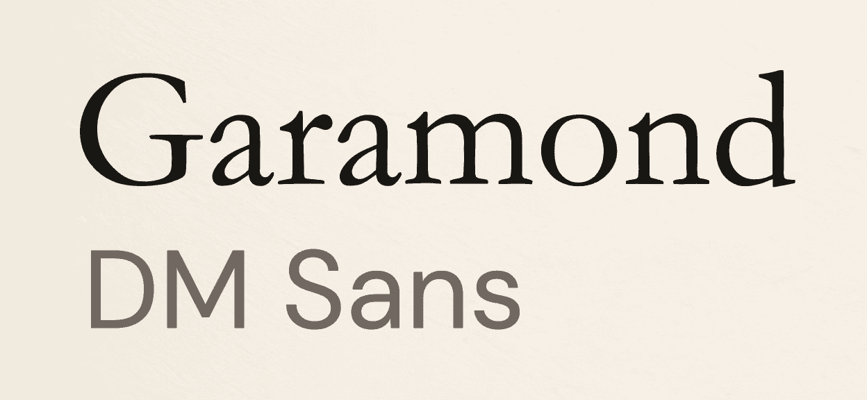
Font pairing
Layout
On desktop I split the page into two columns, so more of the playlist shows without scrolling. The columns stack on smaller screens.
Pause for accessibility
Before calling it done, I ran a WCAG 2.2 AA audit and found seven failures. Most came from one warm gray that was too light for text, plus a green “Save to Spotify” button at just 2.6:1 contrast. I darkened the gray, deepened the greens and gave the book title field a clear border and focus ring, so every text and control now passes.
I added a “Pause background motion” control that the browser remembers. Smaller fixes made the book title a heading, cut screen-reader announcements to one per search, and stopped animations for anyone who prefers reduced motion. After the changes, the automated scan finds no violations on any page state.
Editing and orchestrating with AI
Claude picks the music inside the app, and it was also my build partner. I set the direction and made the calls.
I described what I wanted, reviewed screenshots at desktop and phone sizes, and approved every change before it went live. For visual decisions, I asked for a few options side by side, like the deckle edges, highlighter colors and headlines, and picked the one that fit or asked for changes.
I also asked Claude to critique my work, not just produce it, starting with an “AI slop” review of my own interface and then a full accessibility audit.
Every change shipped as its own small step, so reverting to previous versions was easy.
Reviewing my notes
Building this app with AI was eye-opening and a lot of fun. I took an idea from a single prompt to a working, public product in a short amount of time, and most of that time went into refining what the AI gave me until it matched my taste.
I learned a lot along the way, from working in the Terminal and setting up a code repository to committing changes and putting the site live on my own domain. Working with Spotify pushed me in a different way. I had to design within someone else’s rules and find the best experience I could inside them.
Next, I’d like to add a way to browse by mood. Instead of searching for a title, you’d pick from moods drawn from common book themes, which also gives people another path when the results for a specific book don’t feel right.
More work










©2026 Darron Davis
©2026 Darron Davis
©2026 Darron Davis
©2026 Darron Davis
©2026 Darron Davis